TOKYO FASHION
CASE STUDY BY:
SANDRA, KAYLE, NADI, HANNAH & DIANA
PROJECT:
APPLICATION

CASE STUDY
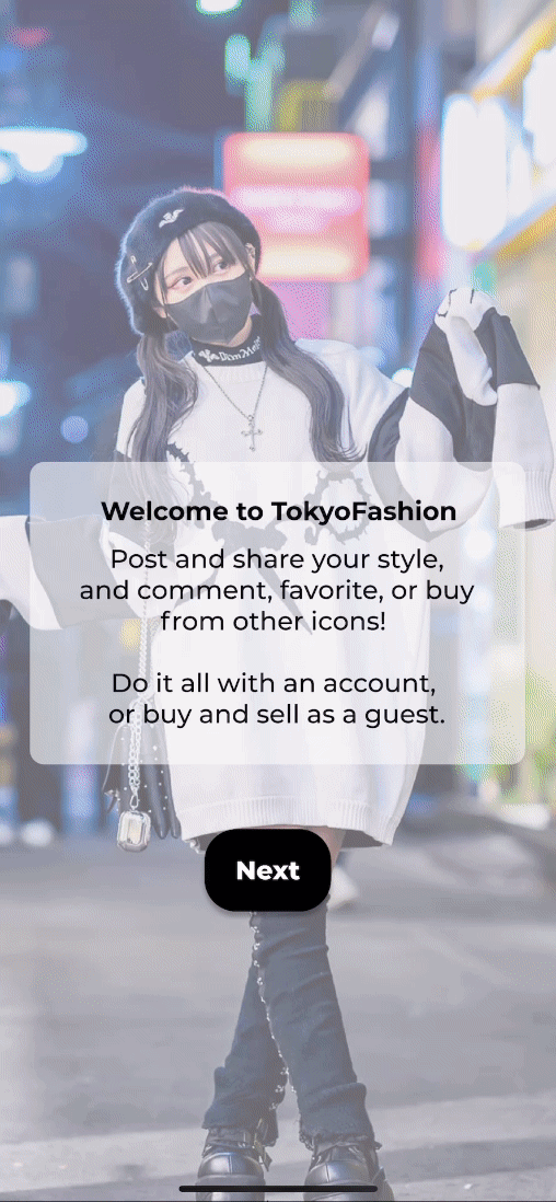
The TokyoFashion app is a popular platform for users to explore Japanese street fashion trends, styles, and culture.
AT A GLANCE
Challenges
-
Lack of search features
-
Difficult navigation
-
Lack of purchasing options
-
No filter options
Solutions
-
Add search and filter functions
-
Integrate purchase options
-
Optimize purchase process
-
Regularly update the app
OVERVIEW
The TokyoFashion app stands as a leading platform for users to delve into Japanese fashion trends, styles, and cultural expressions. Nonetheless, a shortfall exists in the app's incapacity for users to search for favored brands or access clothing purchasing options. Our objective is to remedy this deficiency by amplifying brand discovery and enriching the shopping experience within the TokyoFashion app.
SOLUTIONS
Our objective is to streamline user experience by implementing efficient brand search functionalities, enabling users to easily locate their preferred brands. Additionally, we aim to facilitate seamless access to purchasing options for all clothing featured on the app, ensuring a smooth and convenient shopping process. Through these enhancements, we aspire to elevate user engagement and satisfaction, ultimately enhancing the overall shopping experience within the app.
RESEARCH PLANNING
We created a user survey with questions surrounding the current application and posted it on a Tokyo Fashion Sub-Reddit to gain an understanding of our audience
Survey


Initial User Testing
We curated questions for users who we each interviewed and tested to see how users interacted with the app
Competitor Analysis
We took a good look of what brands with similar visions were doing differently or similarly.
Prototype Testing
After research and prototyping, we tested and continued to iterate based on results

EMPATHIZE & DEFINE
Primary Questions
-
What is your age range?
-
What websites do you like to use for fashion inspiration?
-
How often do you look at fashion online?
-
What apps do you use?
-
Which design elements do you find most appealing on fashion websites?
-
Are you familiar with Tokyo Fashion?
Over 90% of users between our survey and interviews mentioned that if they were looking at fashion they were looking to buy
40% of users we interviewed stated that navigation was one of the most essential elements for them to use an app

Artifact 1: Survey
Usability Questions
-
What is your first impression of the app?
-
What do you think of the app's aesthetics?
-
Please view an outfit's collection of photos
-
Please "favorite" an outfit that you like
-
Please find the "Favorites" section of the app
-
What did you like or dislike about the navigation and design?
-
What are features you appreciate about the app?
-
Are there any features you'd like the app to have?
-
What would you use this app for?
RESEARCH PLAN
(USER INTERVIEW QUESTIONS & FINDINGS)
RESEARCH PLAN
(SURVEY RESULTS)
Results
We set out to get a better sense of our audience by launching a survey on a Tokyo street fashion sub Reddit. After collecting our results, we found that users felt that the outdated interface was difficult to navigate and lacked a streamlined onboarding process. Users also expressed a desire for a search feature and a sleek interface that would better match the app's content.
USER PERSONA
COMPETATIVE ANALYSIS
Kate L.
-
25 YO
-
Design Student
-
enjoys using social media platforms to find inspiration for her art
-
believes her style leaves a lasting impression
Backstory
Goals
-
Wants to pilot overseas fashion trends to US audiences
-
Keeps track of growing fashion brands to someday work with them
-
Make professional first impressions
Pain Points
Kate searches for inspiration when she needs new clothes, professional and personal, and pays close attention to brands and influencers/models to reach out for freelance opportunities when she hears of new brand launches.
-
Losing inspiring outfits
-
Not being able to pinpoint the right aesthetic or clothing items
-
Not being able to trace the brand name or clothing creator
-
No one asking her where she got her new clothes
The final part of defining our user base involved creating a competitor analysis to figure out the qualities and drawbacks of our competition and see what we may want to add or improve upon based on the information we come across. These were our finding for our indirect competitors.

.jpg)
Once our team had gathered a sense of our audience, be developed a user persona based on the research findings we collected from the survey and interview

Artifact 2: Competitor Analysis
IDEATE & PROTOTYPE
User Flow
For the User flow we wanted to highlight the shopping feature that was to be added to the revamped application. We began to outline TokyoFashion’s new navigation by illustrating our user adding an item to their shopping cart for purchase by using the search bar and filters.
To the right is the first iteration of the user flow that would later develop and change based on prototyping and user testing results ( Artifact 3 ).
Wireframe Sketching
Once we had decided as a team how we wanted our first prototype to flow, we began sketching and fashioning the very beginnings of our first low fidelity prototype. This prototype would later be placed into Figma, made clickable, and used to do initial user testing to find errors and opportunities in our work.
Ideas & Takeaways From Competitor Analysis
1. Users want frequent updates to help with engagement
2. Users need to be able to access content and share it as a guest / without hitting a paywall
3. Users want high photo resolution, great close-ups, and a gallery scroll page
Artifact 3: User Flow (#1)
Loading Page
Start
Home page
Click Search Bar
Search Results Page
Click outfit/item of intereest
Add Item to cart
End
Low Fidelity Prototyping
While we compared and contrasted our wireframe sketches as a team, we ended up creating bare bone low fidelity wireframes using Figma to collaborate more efficiently and create what would be the prototype we would use for initial user interviews.


Artifact 4: Wireframe Sketches


Lo-Fi Usability Test Findings
The results of the user interviews proved to be incredibly insightful and useful in making the changes necessary for user success. During the interviews we asked users to go through our app as guests, find black boots from the brand Gothic Lamb, and add the boots to their cart. The majority of the interview findings filtered into three main categories: Hierarchy, User behavior and aesthetics. Below are the main takeaways.
Hierarchy:
-
Title hierarchy caused confusion
-
Items for sale were hard to view in individual post layout
-
Users wanted more specific sale info
User Behavior:
-
Back buttons weren’t responsive in some cases
-
Users ignored filters options when trying to find a specific item to check out
Aesthetics:
-
Photos weren’t large enough
-
Button style made text difficult to read
Iterating the User Flow
Once we had reviewed the results of the user interviews, we quickly discovered that we needed to make edits to the user flow to continue prototyping. Below is the iterated version of the flow after diagnosing issues in primary usability testing. (Artifact 5)
new user OR log in
Welcome Page
log-in as guest OR create acct
Select styles you like
Search Results Page
Filter for black boots
Search for Gothic
Lamb
Home Page
Click outfit/item of intereest
Add Item to cart
End
Artifact 5: User Flow (#2)
Loading Page
Start
Once we had established our new user flow, we began developing a cohesive brand voice by creating a style guide. We picked fonts, colors and element styles that matched the look and feel of the revamped application.
(Artifact 6: style guide)
Developing the Style Guide
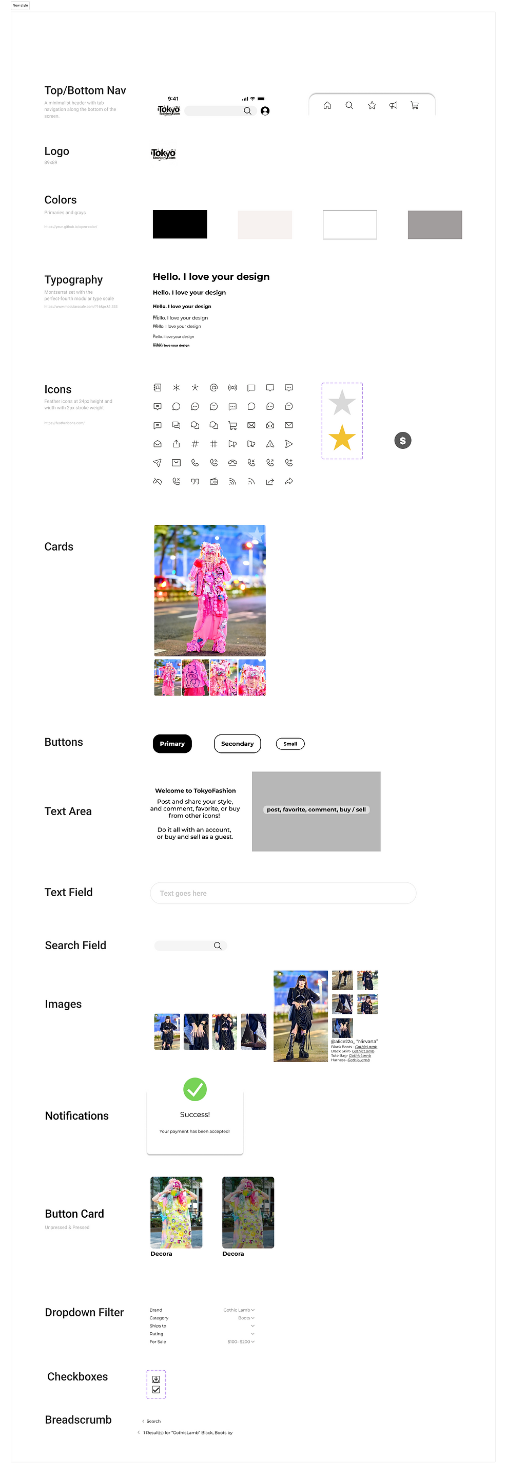
Artifact 6: Style Guide
High Fidelity Prototyping
After meticulously curating our brand voice through our style guide, we added color and design features to a new version of the prototype, creating a more cohesive looking app. During this phase we also began the process of usability testing for the second time to catch any mistakes and continue to edit as we improved our designs. See artifact 6
Usability Testing
In the final stages of re-design, we did as many usability tests as we could to identify any pain points or holes in our work. While 100% of test users were able to complete the same task of placing black boots from the brand Gothic Lamb into their respective carts, we did identify minor changes that needed to be made. Some of our back buttons needed to be linked up to the correct page and we needed to be able to specify to the user through graphics that the login feature was disabled (due to it not being apart of our original flow).
Prototype Access Link
In the future we hope to redesign the filter menu for user clarify and aesthetics. We also hope to introduce sponsored posts, create a portal for creators in the onboarding process or imbedded within the settings, and flesh out a proper check out process.